Viewing documentation for the Availability Search WooCommerce Bookings Plugin
Viewing documentation for the Availability Search WooCommerce Bookings Plugin
The Availability Search for WooCommerce Bookings is mobile friendly out of the box. We’ve done our best make the search automatically fit your theme. However there a few things you can change to improve the experience for your mobile users.
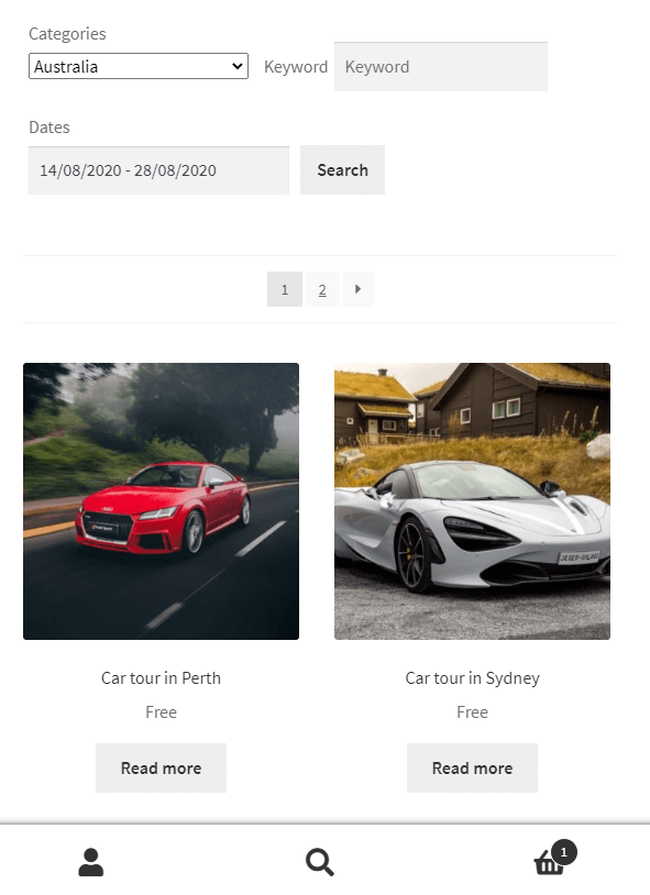
You might display the bookings results in 3 or 4 columns for desktop users. However that would make the products very small on mobile devices.
We highly recommend the offical Store Front theme for WooCommerce. Store Front will automatically display the results in a single column on mobiles. The CSS snippet below will change the columns to 2 on smaller screen sizes. This snippet should work on other themes too.
.aswb-results ul.products li.product {
	width: 46.411765%;
	float: left;
	margin-right: 5.8823529412%;
}

.aswb-results ul.products li.product:nth-of-type( 2n ) {
	margin-right: 0;
}

@media ( min-width: 768px ) {
	.aswb-results ul.products li.product:nth-of-type( 2n ) {
		margin-right: 5.8823529412%;
	}
}Code language: CSS (css)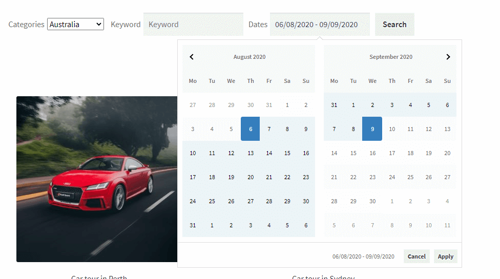
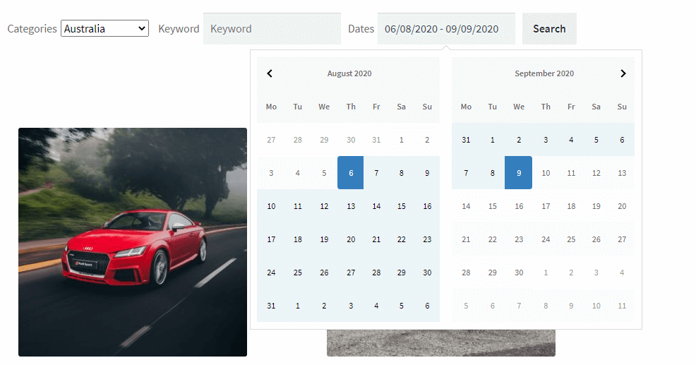
Currently when you select the dates in the Availbility Search date picker you’ll see two buttons. “Apply” & “Cancel”, these buttons allow users to make sure they’ve got their date selection right before starting the search for bookable products.
However these 2 buttons can be removed if you wish to automatically apply the dates when the user has selected the end date. it’s one less click for mobile uses.
The auto apply dates feature can be added per search using the shortcode. You’ll need to add auto_apply_dates="true" to your shortcode.
For all the shortcode examples click here.